Summary Graphic Help
Overview of the Summary Graphics
These summary graphics (also known as infographics) pull thousands of data points directly from our database. These infographics allow you to customize the data shown by age, gender or location. As a result, these infographics can be used to understand:
- who participated in our fairs
- what the average value is for a specific category, like body fat percentage
- how many people in a community meet recommendations, based on the individual’s age and gender.
To protect the privacy of the people who have gone through our fairs, everything on this site is anonymous. We also automatically hide values if the number of participants in a particular category becomes too small (<5).
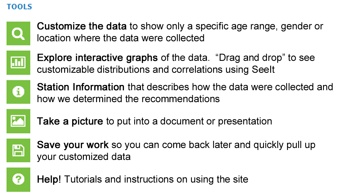
Basic Instructions
1. Find the data from the homepage by clicking on the blue “Explore Data” box
2. Click on the type of data you want to see (Body Size, Diet, Sleep, Cancer Risk, etc).
3. Use the tools menu to customize the data you want to see, find more information and save your work!
Tutorials
Use this instructional overview (.docx or .pdf – 25 pages) to find information on how to:
Customize and filter data
Take a picture of your work with a screenshot
Create a log in
Save your work
Get more information about the data
Linking to SeeIt