Science Fair Tools
How to use this site for science fair support
 Sources of Ideas for science fair investigations:
Your students can use actual health data in a science fair investigation. We’ve got lots for you!
- They can compare teens and adults in terms of daytime sleepiness. We can share data on hundreds of people in each group.
- They might be interested in knowing the percent body fat for middle school students so they can compare results for boys and girls? We can give you data on more than 2000 students.
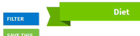
- Have a look at the web page graphics in the “Explore the Data” pages. Try out the “Filter” option. Do some quick visual comparisons. You may find something that will intrigue your students.
Types of investigations that might lead to interesting science fair questions for your students:
- Comparisons of age groups
- Comparisons of males vs. females
- Comparison of urban vs suburban results (Click here for descriptions of Let’s Get Healthy! fair locations. Coming soon: we’ll be tagging each event based on their urban/suburban/rural classification at the time of the fair)
- Correlations between items measured in the fairs (use the SeeIt tool to do correlations – a link to SeeIt is located on the “explore data” pages)
If you use the SeeIt graphing tool, you can plot distributions of single data sets and automatically compute the mean, mode and median for the data or you can investigate correlations (relationships) between two variables. You can try important correlations like blood pressure and dietary intake or you can look for unusual correlations such as dairy intake and height. Each of these datasets can be separated based on age,so you can pull out adults, middle school adolescents, males, females, and more.
Some Interesting examples…
The following three examples will teach your students to use the filters.
In the first example, you show them filter use. In the second, you guide them while they use filters on their own computers. In the third, you challenge them to use filters on their own:
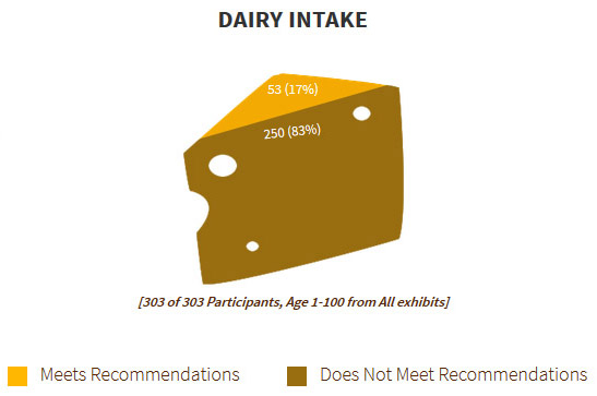
Diet Station –– Dairy Intake graphic
Go to the “Explore Data” “Diet” page. Notice that the general population doesn’t have many people who meet the dairy intake recommendations. Only 17% of the people are getting enough dairy.
Now use the filter box to look at only females over age 40.
Check off the female check in the middle of the box and slide the left slider from the far left toward the middle of the page until the age range show 40 to 100 years.
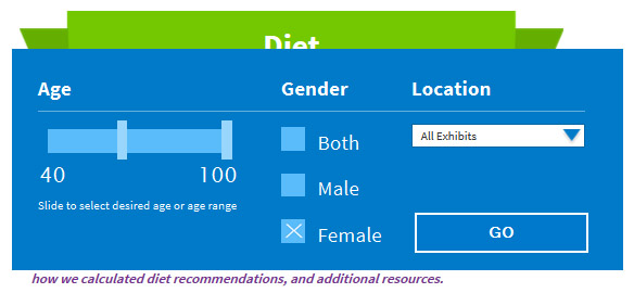
Click “GO” and look at the graphic.

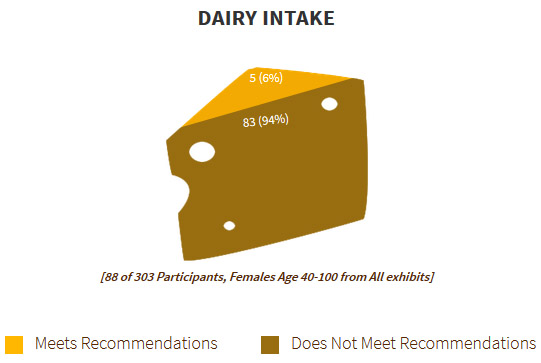
Now we find that only 6% of the women over 40 are getting enough dairy. This dairy intake is an important source of calcium which maintains bone strength.
Body Size Station –– BMI Graphic
Look at the general population Body Mass Index graphic. Notice that 62.8% of the overall group has a BMI which is classified as “Healthy.” Now use the filter to select the data from St Helens Middle School. There 59.8% are classified as “Healthy.” Compare this to the BMI for Wilsonville-West Linn middle schools. At those fairs, 79% were “Healthy.”
Skin Cancer–– Sun Safety Scores
Look at the general population sun safety scores and use the filters to compare the percent classified as “Excellent” for persons 0 to 20 years old and those 50 to 100 years old.
Other Support for Science Fair people:
The station description pages provide information for your students on the measurement protocols used, the health recommendations that were used to classify the results, sources of information for the general public and a research bibliography which documents the research support for background on the station measurements and classification at a professional reading level.
Source of data and privacy issues:
One discussion that can flow from the website is a discussion of research ethics. Investigators concern themselves with the sources of their data whether they are taking measurements themselves or using data from another study. All the data available from the Let’s Get Healthy! website was obtained under the supervision of the Institutional Review Board at Oregon Health and Science University (OHSU Protocol Number 3694). Only anonymous, public data is available on the website per their repository protocol governing data release (OHSU Protocol Number 7068). In a few cases, the number of subjects that fall into a category would be too small to guarantee anonymity. In those situations the data about those subjects are not available on the website and are reflected as “<5 (0%)”. This is similar to procedures used by other national websites showing data, like NHANES. All of our website data may be used under International Science & Engineering Fair (ISEF) rules.
More Data Available:
The data filters on the website and the data sets on SeeIt represent only part of the data in the Let’s Get Healthy! database. Your student researchers can make additional requests for data from the Let’s Get Healthy! scientists. For example, they may want more specifics about data taken at a certain fair or from people giving certain responses on the diet or sleep surveys. To request such data, they should send their inquiries describing their preliminary research plan to LGH@ohsu.edu. If their request is approved, they will be asked to complete a OHSU/IRB user agreement. Please advise your students that requests take time to process and that they should plan ahead.
If you are participating in an Intel ISEF (International Science & Engineering) fair
With the data you request, you will be sent a certificate from the Let’s Get Healthy! Scientific Advisory Board stating that the supplied data qualifies as an “Exempt Study” under the ISEF Human Studies Rules (2014 rules page 8) because the data have been appropriately de-identified (anonymous in this case), are in compliance with all privacy and HIPAA laws, and the program is approved by the Oregon Health and Science University Institutional Review Board (protocols #3694 and #7068). This will allow to you to use this data without pre-approval from your local or regional SRC. For more information on ISEF rules, please visit this site: http://www.societyforscience.org/document.doc?id=14
A great tool for graphing your own data:
The SeeIt tool developed by University of California at Davis researchers can be used for any data you want to display and analyze. Here’s how to use if for your own data:
- From any of the “Explore Data” pages, you can use the SeeIt button to access the SeeIt tool. Scroll down to the bottom of the left list of data sets.
- At the bottom you will see the option, “Add Worksheet.” This will open a blank page where you can paste data from an excel spreadsheet. In the excel worksheet, put the label in the first cell and all your values below. Copy that column and paste it into the SeeIt page. Choose “Load Worksheet from form.”
- Your new data set will appear on the data set list near the bottom. Drag that data set to the bottom of the blank graph and your distribution will automatically show.
- Remember you can use the tools (the wench at the upper left) to add mean, median, mode, quartiles and histograms. Have fun. This is a powerful tool!
We have a basic orientation to SeeIt here.